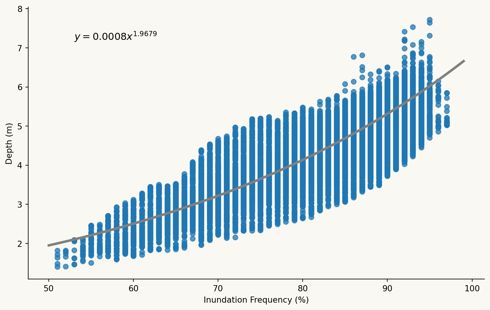
The relationship between inundation frequency (IF) and bathymetry is modelled using a boat survey conducted by a team of researchers at one of the lakes within the middle-lower Amazon reach – Curuai (Barbosa et al., 2006). The more frequently inundated parts of the lake are generally observed to be deeper, hence the depth of Curuai measured from the bathymetry survey is plotted against how often that part of Curuai is flooded.
Code
import numpy as npimport matplotlib.pyplot as pltimport rasterio as rio# Import Curuai IFIF_CR = rio.open("../data/IF_CR.tif")# Read into a NumPy array (only 1 band)IF_CR_np = IF_CR.read(1)# Plotfig, ax = plt.subplots(figsize=(10, 4))img = ax.imshow(IF_CR_np)# Set background to beigefig.patch.set_facecolor("#F9F8F2")ax.set_facecolor("#F9F8F2")# Create an inset axes for the colorbar in the bottom rightcax = ax.inset_axes([0.75, 0.8, 0.15, 0.03]) # [x, y, width, height]# Colorbarcbar = fig.colorbar(img, cax=cax, orientation='horizontal', shrink=0.3)cbar.ax.set_title("IF (%)", fontsize=10, pad=4, color='white') # titlecbar.outline.set_linewidth(0) # remove black outlinecbar.ax.tick_params(size=0) # remove tickscbar.ax.xaxis.set_tick_params(pad=4, colors='white') # tick labels# Remove axes for clean aestheticsax.axis("off")
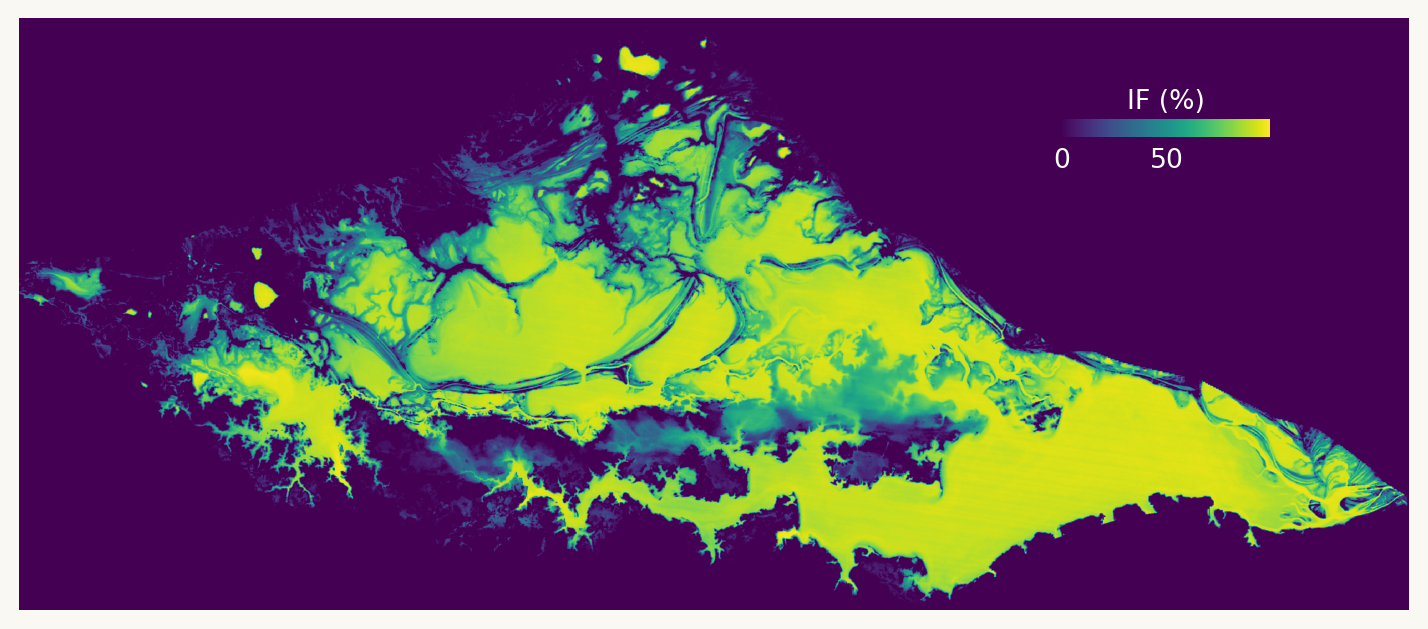
Figure 1: Inundation frequency at Curuai
Code
import numpy as npimport matplotlib.pyplot as pltimport matplotlib.colors as mcolorsimport rasterio as rio# Import curuai reprojectedcuruai_proj = rio.open("../data/Barbosa_bathy/Barbosa_bathy2.tif")# Read into a NumPy array (only 1 band)curuai_proj_np = curuai_proj.read(1)# Change <0 to NaNcuruai_over0 = curuai_proj_npcuruai_over0[curuai_over0<0]=np.nan# Define breaksbreaks = [0,1,2,3,4,5,6,7,9.999783]# Define discrete colormapcmap = plt.get_cmap('BuPu', len(breaks) -1)norm = mcolors.BoundaryNorm(breaks, cmap.N)# Plotfig, ax = plt.subplots(figsize=(9,14))img = ax.imshow(curuai_over0, cmap=cmap, norm=norm)# Set background to beigefig.patch.set_facecolor("#F9F8F2")ax.set_facecolor("#F9F8F2")# Create an inset axes for the colorbar in the bottom rightcax = ax.inset_axes([0.7, 0.8, 0.15, 0.03]) # [x, y, width, height]# Colorbarcbar = fig.colorbar(img, cax=cax, orientation='horizontal', shrink=0.3)cbar.ax.set_title("Surveyed depth (m)", fontsize=10, pad=4) # titlecbar.outline.set_linewidth(0) # Remove the black outlinecbar.ax.tick_params(size=0) # Remove ticks# Custom tick labelscbar.set_ticklabels(['0','','','','','','','','10'])cbar.ax.xaxis.set_tick_params(pad=4) # tick labels# Remove axes for clean aestheticsax.axis("off")
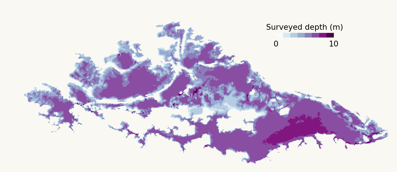
Figure 2: Surveyed depth at Curuai
Data points with IF below 50% are found at peripheral lake boundaries, which are elevated and mostly remain dry even during the wet season, or in small lakes (under 1 km2) disconnected from the river (Park et al., 2020). These points are excluded from the IF-depth model, to focus on the large and interconnected round lakes that are more sensitive to the model. Even with the exclusion of such points, 70.8% to 93.8% of the floodplain areas are retained for bathymetric calculations.
Code
import numpy as npimport pandas as pdimport matplotlib.pyplot as plt# Load data on modelmodel = pd.read_csv("../data/model.csv")def exponential_regression(x, y):"""Calculates the exponential regression line for given x and y values."""# Transform the data into a linear relationship log_y = np.log(y)# Perform linear regression on the transformed data coeffs = np.polyfit(x, log_y, 1)# Extract the coefficients a = np.exp(coeffs[1]) b = coeffs[0]# Return the exponential functionreturnlambda x: a * np.exp(b * x)regression_func = exponential_regression(model['IF'],model['Depth'])# Trendlinetrendline = regression_func(range(50, 100))fig, ax = plt.subplots(figsize=(10, 6))ax.scatter( model['IF'], model['Depth'], marker="o", alpha=0.75, zorder=10)# Plot the regression line on top of the scatter plotax.plot(range(50, 100), trendline, color ="grey", linewidth=3, zorder=15)# Annotate equationplt.text(53, 7.2, r'$y = 0.0008x^{1.9679}$', fontsize=12)# Format graphax.set_xlabel("Inundation Frequency (%)") # x-axis labelax.set_ylabel("Depth (m)") # y-axis labelax.set_facecolor('#F9F8F2') # background colourfig.patch.set_facecolor('#F9F8F2')ax.spines['top'].set_visible(False) # turn off 2 linesax.spines['right'].set_visible(False)